2 Ways to Create Eye-Catching Visual Content for Your Online Ads
Home | The Market Buzz | 2 Ways to Create Eye-Catching Visual Content for Your Online Ads

Compelling visual content is central to a successful online advertising campaign. Banner ads are a key element that should not be overlooked, as they are the first touchpoint between you and your target customers.
Obviously, the broader context and overall strategy have a huge impact on the success of your digital marketing campaigns. We dive deeper into these notions and all the essentials you need to know about online advertising in our M32 Academy.
In this post, we want to touch more specifically on the creation of your ads (often called “creatives”). When using the Ad Center to create and deliver your campaigns, you have 2 options to complete this step. We’ve put together some helpful tips on how to create visual content to maximize impact as well as a guided tour of the method of your choice.
Which option will you choose: a turnkey assistant that does the work for you, or the option to upload your own creatives to go a step further in customizing your own banner ads?
What to consider when creating visual content for your ads?
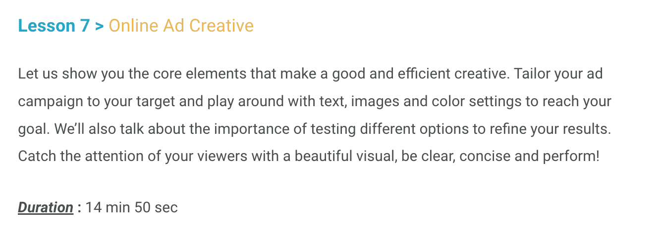
If you haven’t already, use our free Introduction to Paid Media course. Lesson #7 walks you through the basics of creatives and messaging.
Below are some quick reminders of the principles covered in this video.
For optimal results and a better return on investment of your advertising expenses, your message should be:
- attractive (choice of photo, copy, and call to action)
- concise (use of different sections, selling points emphasized)
- clear (your logo clearly featured, consistent across different formats)
More practically, here are some useful tips to help you create your visual ad:
- The banner should be easy to differentiate from the content of the page (e.g., with a visible border or a strong contrast in the chosen photo)
- Your ad should be consistent with the content and context of the publisher’s site
- The dominant colour has an impact: select a colour that matches what you intend to evoke
- Use the language of your target consumers
- Experiment to test what works best!
To review these best practices in detail and access other useful information, such as “When to change your creative?”, head to our free courses.
A compelling image
You can use your own photos if they are of high quality and convey your message. Using your own photos will make your ad unique and customized to your brand. If you do not have any photos available, you can select one from professional image banks, such as:
Choose an image that matches the general tone of your communications (e.g., humorous or serious) and that evokes your product or service.
Important note: Remember that you absolutely must have the right to use this photo for commercial purposes. To help you keep this in mind and avoid any negative repercussions, our campaign creation tool will make you acknowledge and confirm this point when you select an image!
A strong brand presence
Your logo is a central part of your brand. Including it in your ads will make it easy for your audience to recognize you. If you don’t already have a version of your logo on a transparent background, we explain how to create one in this video, so you’ll be able to display your logo over any image background for a more cohesive look!
Your company’s visual identity also depends on your choice of colours. Define your personalized colour palette to maintain cohesion and consistency across all your ads. If you need a virtual hand to make those choices, here are some AI-powered tools that can help:
A short and catchy title
The hook must be short (max. 50 characters) and punchy to appeal to your audience and convey your main message.
If necessary, the title may be completed by a secondary header for added detail.
The goal of these messages is to grab users’ attention and generate enough interest so that your audience will want to click on your ad to go further.
A call to action
The ultimate goal! The Call to Action (CTA) is the button at the bottom of your ad that takes users to the next step. The text should be very short (max. 25 characters), clear and enticing.
Try to make the action clear for your audience with a verb that tells them what to expect. The text will depend on what you have planned as the next step, i.e. once the person clicks on the button.
Here are some examples:
- Register (for an event)
- Subscribe (to a newsletter)
- Make a reservation / Book now (for a restaurant, hotel, activity, etc.)
- Make an appointment
- Try for free
- Learn more
- Join us (to be part of a group)
- Get 50% off (or any other promotion you choose)
- Buy now (invite to complete the transaction)
- Contact us (to receive messages or leads)
Method 1: Ad creation made easy with a self-service online wizard
Now that you have all the necessary elements to create eye-catching visuals for your online ads, you may choose among 2 ways to create them.
Log into your Ad Center and click on the “New Campaign” menu. After filling in your “Campaign Information” (name, devices, language, sites, target audience, dates and budget), you will get to Step 2: “Creation”.
The first option is called “Build Your Custom Ad”. It is a very simple process that only takes a few minutes. No web design expertise or talent is required!
It’s the perfect tool for beginners or companies looking to maximize their time and budget.
How it works
Simply follow the steps shown in the online tool and fill in each of the fields:
- A main photo
- Your logo
- Your colour palette
- A title
- A description
- Your Call to action
- The destination URL address
Then CLICK and watch the magic happen!
The self-service tool will automatically generate your ad in the different formats required. You can preview them and modify them instantly, as needed.
Are you more of a visual learner? We walk you through the steps in the following video:
Method 2: Import your own existing visual content
You may choose to make your own creatives using other tools, to hire a graphic designer or have an agency to create them for you.
This step naturally requires investing more time and money, but this decision may be appropriate based on your overall strategy. You can ensure that you use exactly the same ads across all your campaigns or even push the design further with a 100% custom-made creation.
The same best practices apply when it comes to creating your images and text. All you have to do is create the right formats for your campaign.
How it works
Step 1 is identical to Method 1 — you will have to fill in your “Campaign Information” as described above. Step 2 is where the process differs. Once you get to the “Creation” step, choose the 2nd option, namely “Upload Your Creatives”.
Depending on the choices you made under Campaign Information, you might need one or more ad formats. Note that we are referring here to the standard formats of the online advertising industry guidelines (IAB standard).
Below is the list of standard ad formats:
Simply import the applicable dimensions based on your campaign settings.
For each visual uploaded, you will also need to:
- Indicate the destination URL (and test it!)
- Confirm that you own the rights to use the image
And voilà, you’re done with this part! Get an overview and finalize your ad creation by clicking on “Preview All the Formats”.
The video below walks you through this method:
And now, Pick a publisher & it’s your turn! Which option will you choose to create your visual ads?
Share:

Lisa Camacho
Based in our Toronto location, Lisa started her career in print media and branched out into sales and client relations for two of the world’s leading brands in the automotive and travel industry. Within the M32 team, she’s leading the publishers and agencies relationships in Canada and the USA. Connect with Lisa if you’d like to learn more about M32!


