Restaurant Advertising Example
Home | The Market Buzz | How to create an online ad for a Restaurant
How to create an online ad for a Restaurant
Online advertising is a very efficient way to increase awareness, get people’s attention and ultimately, attract more clients for your products and services.
As the owner or manager of a restaurant, you can create ad campaigns for a variety of purposes: share promotions or special events, emphasize a specific product or service, attract new clients, take more reservations or online orders, etc.
Be strategic with your planning! Don’t hesitate to refer to our Marketing Calendar and use events/dates that are relevant to your industry to create a perfect timing for your ad! For example, you could refer to:
- Super Bowl Sunday (in February, the date varies from year to year)
- Valentine’s Day (February 14)
- National Fresh Fruit and Vegetables Month (June)
- Chocolate Day (July 7)
- Coffee Day (September 29)
- World Bread Day (October 16)
Read below to know all the components of the perfect ad, useful tools you may need, as well as some concrete examples to inspire you!
Global Ingredients
Before building an ad, please make sure that you have all the rights to use any image, logo or content for commercial purposes.
To build an Ad on any M32 Ad Centers, you need seven ingredients. Click on any item below to find more info about each one.
Your lead message, or ad headline, should express your main message for your audience in 50 characters maximum. This piece comes first as you’ll be building your ad around this primary message.
The lead image has a dimension of 300 pixels (width) by 200 pixels (height). We strongly recommend using your own pictures representing your products or services. However, if you don’t have any relevant images, you can use external services such as:
Your logo must be at least 300 x 130 pixels (width x height). Ideally, your logo should have a transparent background, for better visual results. If you don’t have a logo with a transparent background already, you can learn how to create one in the following video:
Alternatively, you can use online services to build a logo for free, such as:
Your can include a secondary message, used as your ad description, with a text of 75 characters maximum.
Please note that this content will not be visible on the 728×90 banner.
The call to action is very important as this is how you invite potential clients or members. It should be clear and short (maximum 25 characters).
Here are some suggestions :
- Sign up now
- Subscribe now
- Try for free
- Get started now
- Learn more
- Join us
- Book now
- 50% off buy now
- Make a reservation
- Contact us now
- Book an appointment
The harmony of colors is a science and an art that allows the final rendering of your Ad looks at its best. Thanks to artificial intelligence, you can now be supported in this process with tools like:
The URL address of your website page or landing page that you want people to reach when they click your ad. It’s important that your message and the landing page are synchronized and offer your clients the ideal information to buy your product or service.
Inspiration and briefing
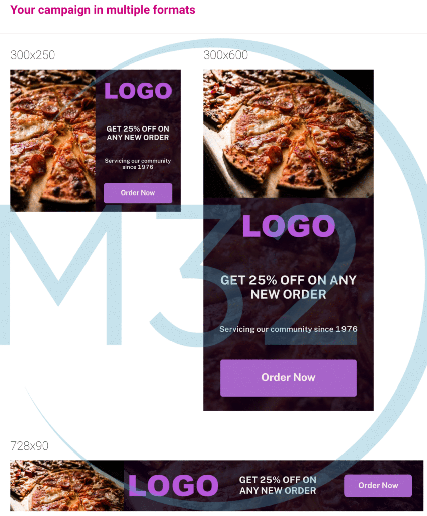
To help you create your own ad, we will detail below the steps we followed to build a sample ad for a pizzeria.
Please make sure to use your own creative – image, logo and text. The following content should be used as inspiration only and not be copied or reproduced.
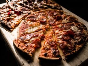
In this example, Let’s imagine we own a pizzeria, and we want to promote 25% off on any new order.
GET 25% OFF ON ANY NEW ORDER
Inspiration taken from pexels.com. We used the following image:
Source : https://www.pexels.com/photo/pizza-on-brown-wooden-board-825661/
In this case we just used a placeholder. but in your case please use your logo.

Servicing our community since 1976
Order Now
We used these 4 colours
- Ad background : #0e0114 ♠
- Ad title colour : #eeeeee ♣
- Call to action button background : #a35dc7 ♥
- Call to action button font : #f7eded ♦
Examples of landing page URLs:
- https://mysite.com/landing-page
- https://facebook.com/mypage/
- https://instagram.com/mypage/
- ….
Visuals
Share :

Stephane Campana
Leading M32 Business Development
