Halloween Advertising Example
Home | The Market Buzz | How to create an online ad for Halloween
How to create an online ad for Halloween
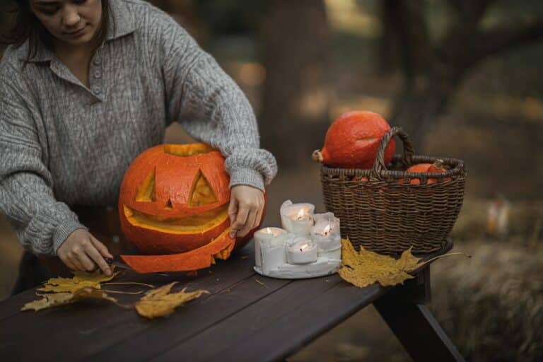
Did you know that Halloween is one of Canadians’ favourite holidays, and a unique opportunity to stand out with original ad campaigns?
We’ve gathered some interesting stats to give you a better idea of the overall buying environment surrounding this event:
- 45% of Canadians celebrate Halloween.
- In 2022, 86% of Canadians who celebrate Halloween plan to spend the same or more as compared to last year.
- More than 60% of Canadians will plan ahead at least a week before Halloween to make purchases.
- Around 55% of Canadians would prefer to shop locally in person for Halloween to support local businesses.
- In 2022, the budget allocated by Canadians to Halloween should increase by 28.4% in comparison with last year, for a total amount of $1.64 billion.
While children and adults are getting excited preparing for that spooky night, your company should too! Halloween could be a particularly good fit for your industry and audience. Spending during this time will be mainly directed towards decoration, costumes, make-up, party accessories, pumpkins, candies and sweets or themed activities.
Even if your products or services are not directly related to Halloween’s usual purchases, it is also a terrific opportunity to get creative with your ad campaigns. By using the Halloween codes (colours, puns, imagery…), you will be able to create striking and impactful visuals.
Read below to know all the components of the perfect ad, useful tools you may need, as well as some concrete examples to inspire you!
Global Ingredients
Before building an ad, please make sure that you have all the rights to use any image, logo or content for commercial purposes.
To build an Ad on any M32 Ad Centers, you need seven ingredients. Click on any item below to find more info about each one.
Your lead message, or ad headline, should express your main message for your audience in 50 characters maximum. This piece comes first as you’ll be building your ad around this primary message.
Halloween Trick: Play with the words you’re using to recall the theme of fear, horror, etc.
The lead image has a dimension of 300 pixels (width) by 200 pixels (height). We strongly recommend using your own pictures representing your products or services. However, if you don’t have any relevant images, you can use external services such as:
Halloween Trick: If you want to quickly evoke the theme of Halloween, you could use visuals of witches, vampires, spiders, ghosts, monsters, skeletons, or even candy, pumpkins or people wearing costumes.
Your logo must be at least 300 x 130 pixels (width x height). Ideally, your logo should have a transparent background, for better visual results. If you don’t have a logo with a transparent background already, you can learn how to create one in the following video:
Alternatively, you can use online services to build a logo for free, such as:
Your can include a secondary message, used as your ad description, with a text of 75 characters maximum.
Please note that this content will not be visible on the 728×90 banner.
The call to action is very important as this is how you invite potential clients or members. It should be clear and short (maximum 25 characters).
Here are some suggestions :
- Sign up now
- Subscribe now
- Try for free
- Get started now
- Learn more
- Join us
- Book now
- 50% off buy now
- Make a reservation
- Contact us now
- Book an appointment
The harmony of colors is a science and an art that allows the final rendering of your Ad looks at its best. Thanks to artificial intelligence, you can now be supported in this process with tools like:
Halloween Trick: Even though it’s normally recommended to remain consistent with your branding, you could totally make an exception and step out of your usual palette for special occasions like Halloween. Most used colours are orange, black, purple and neon green.
The URL address of your website page or landing page that you want people to reach when they click your ad. It’s important that your message and the landing page are synchronized and offer your clients the ideal information to buy your product or service.
Inspiration and briefing
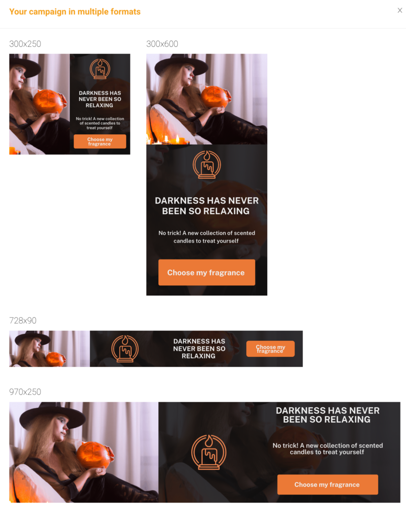
To help you create your own ad, we will detail below the steps we followed to build a sample Halloween ad for a scented candle store.
Please make sure to use your own creative – image, logo and text. The following content should be used as inspiration only and not be copied or reproduced.
DARKNESS HAS NEVER BEEN SO RELAXING
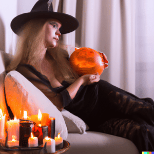
Inspiration was taken from DALL-E (https://openai.com/dall-e-2/), a site that creates images using artificial intelligence and natural language. We used the following search terms:
Halloween witch relaxing on a sofa next to a lit candle and a carved pumpkin
Based on a free icon service, we used the following image:
Source: https://www.iconfinder.com/icons/4167898/burial_candle_cultures_flame_pray_prayer_ritual_icon
![]()
No trick! A new collection of scented candles to treat yourself
Choose my fragrance
We chose these 4 colours:
- Ad background: #111111 ♠
- Ad title: #eeeeee ♣
- Call to action button background: #EB7936
- Call to action button font: # eeeeee
Examples of landing page URLs:
- https://mysite.com/landing-page
- https://facebook.com/mypage/
- https://instagram.com/mypage/
- ….
Visuals
Video: How to build your custom Ad
Video: How to upload your own creatives
Share :
Lisa Camacho
Based in our Toronto location, Lisa has several years of experience in ad operations and digital sales. Within the M32 team, she’s leading the publishers and agencies relationships in Canada and USA. Connect with Lisa if you’d like to learn more about M32!
